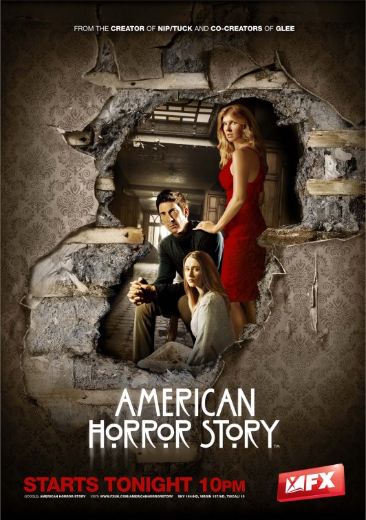
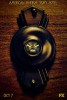
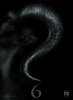
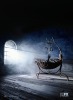
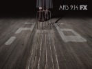
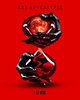
IMP Awards / TV Poster Gallery / American Horror Story Poster (#7 of 177)
other sizes: 1058x1500 / 1666x2362 Poster design by Mister.S
Additional designs: (view gallery)
Want to buy the poster? Try these links: