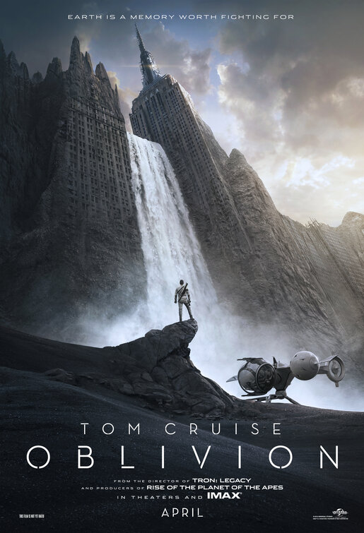
IMP Awards > 2013 Movie Poster Gallery > Oblivion Poster
| J.Calleja Mar 01 01:07:02pm "Earth is a memory worth figthing for". The film Se7en ended with Mr.Freeman quoting Ernest Hemingway; "The world is a nice place and is worth figthing for,...I agree with the second part" |
| FYI Feb 22 12:41:44pm Ripped off http://simotron.wordpress.com/2013/01/02/tsunehisa-kimura-oblivion-joseph-kosinski/ |
| z Dec 13 07:55:35am Beautiful.. |
| Dr. Zoid Dec 13 01:19:25am Really clean epic poster with an a cool ship. Love the typography used here. |
| Nick Dec 12 10:42:37am Neutraface: now with fractures! |
| Rider Dec 11 10:29:30pm Awesome scenario. |
| Inspired Dec 11 01:14:19am Beautiful. So well executed. Truly the way an epic, scopic poster should look like. |
| art director Dec 11 12:34:23am bad ass! |
| Babangnya Toto Dec 10 10:04:50pm Awesome |
| Dania Dec 10 07:18:19pm Beautiful. Epic. Clean. Cool logotype. Love the copper and blues your getting in the sky. |
| jooks Dec 10 06:22:28am manhattan is sooo abused by hollywood! nice though. |
| boring Dec 10 02:45:06am copycat of dark knight, dark knight rises, star trek: into darkness and others bla bla bla |
| brain-mixer Dec 09 06:50:33pm Stunning poster! |
| Skippy Dec 09 07:23:55am This is the first poster I've seen in a long time that actually makes me want to see the movie. |
| David Dec 09 01:42:40am THIS is how poster should look. I'm not even a fan of Cruise, but this is going up on my wall. |
| IronKnight Dec 08 05:35:26pm WOW. Stunning poster. |
| Lsli Dec 08 09:24:05am hmm like it! |
| 1111 Dec 08 09:01:20am good |
| Mel Dec 08 08:45:13am The silhouette in front of buildings in ruins and forced perspective is getting overused... but this one is a good take on that. |
| Andris Dec 08 06:25:31am And I nominate this as Best Poster of the Year! |
| Wayney P Dec 08 06:12:44am Nice striking image. |
| Bill Dec 08 03:03:04am Very nice |
| radiofan Dec 08 12:31:18am Love, love, love this poster... the colors, the font, the tagline, how real does it look... Although is hard to imagine how the hell does New York ended up like that |
| HOORAY Dec 07 10:03:04pm WELL DONE! For once we have an epic movie poster that still has design and nice typography! |
| Woodnco02 Dec 07 07:52:55pm Grey poster but when its really small I thought the poster was flipping me off. |
| Kale_Reese Dec 07 07:00:06pm Say what you will -- this is epic, emotional, and beautiful. I love it. |
| Elliot from LA Dec 07 06:46:02pm I like this a lot, looks like something I would see in a dream. |
| GC Dec 07 05:34:39pm one of the better "oh look at this destruction of a famous building" teaser posters |
| FunkY Monkey Dec 07 05:21:08pm It's so simple and yet visually stunning & captivating. |
| Alex Dec 07 05:06:50pm I like it. Its like Planet of the Apes meets Fellowship of the Ring. |
| gripmonster Dec 07 02:59:50pm The Star Trek and Man of Steel poster designers should take some notes. THIS is how you do a teaser poster. Beautiful, haunting, stunning. Love it. |
| Dr. Zoid Dec 07 02:47:57pm There are a lot of post-apocalyptic films coming out this days, but I really am digging this teaser poster. Love the front and the color scheme. The ship is also pretty bad ass. |
| Yes Dec 07 02:47:38pm Well done! |
| Sam Dec 07 02:40:29pm Love it. |

