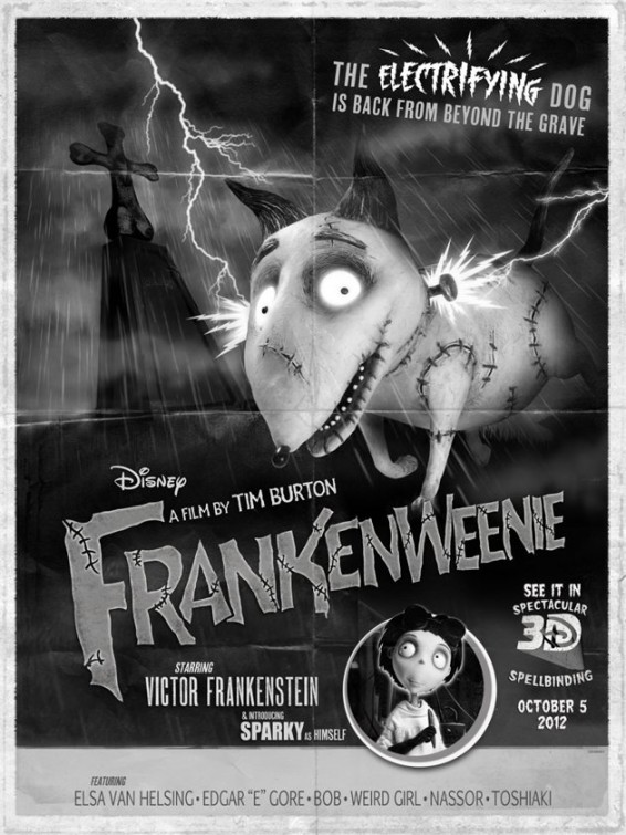
bleeker Jul 18 07:37:14pm I agree with the nude emperor - if you are going to do an homage to a classic style - don't half ass it!!! Sparky looks unappealing. The mix of photographic and vector lightning is odd. The bolt isn't even reacting to the light - OYE! And.... Yes the Headline looks like it was stuck on by a kid with no typography training.
Matt Jul 16 09:50:31am Amazing! I can't wait.
thenudeemperor Jul 13 12:44:52pm Sorry, I don't agree - I think it's weak because it's trying to be the classic hand-painted poster of the 1930's, but its photoshopped handling makes it just look inauthentic. The headline typography is WEAK- it's so static and flat! If they had composed this and then had someone paint over it in old fashioned gauche / tempera, and hand letter it - it would be a collector piece.
Jake Jul 12 02:22:26pm This should be the final one-sheet! Catches the true spirit of the what the movie is and its style. I'd love to see how the poster looks inside a theatre on display.
trinityjkb Jul 12 02:15:17pm Great style and typography.
jerry the man Jul 12 01:37:44pm Fantastic poster! I absolutely love it!