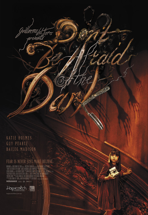
SpicyMag Oct 03 04:33:55am Greatness. The fact that it's hard to read, would only make people stare at it longer and remember the title once they read it.
Dania Sep 29 04:14:24pm Love this title! Sure it's a little hard to read, but it's so playful, textural and overall pleasing to look at. Very gutsy! Good Job!
Dorian Sep 29 01:12:52pm this is nearly impossible to read. big no-no in marketing. nice try tho. would work well as a fine art piece.
Chipp Sep 29 01:12:09pm Don't be afraid of the Title
LeZee Sep 29 09:06:05am Awesome
Franklin Sep 28 04:15:43pm Even though/(because) it's unreadable, i like this one the best.
The unreadability draws you in instead of boring you like the shadow hands....
Lord Sep 28 02:02:34pm This one is the best so far.The title is great,original I love it.The only problem is the title is hard to read. I was only able to read it because I know it already.
Ben Skevofilax Sep 28 01:54:03pm This is the official Australian poster and it somewhat weird, I first thought that the 'K' in Dark was kitchen implements and thought it was a culinary horror film.
It's very strange, quiet similar to earlier posters but the logo is all over the place and seems out of place altogether. I do however give credit to the designer of the poster for trying something different.
Blake Sep 28 01:30:09pm Great Great creative Title Treatment, but the poster's ruined by the stupid classification box.