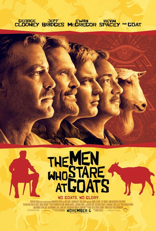
| | Xgames | 09-15-2009 22:40 [E,W] | This poster is so funny on so many levels.
It's wonderful. |
| | Jeremy | 09-16-2009 00:57 [E,W] | | Okay, this Saul Bass theme is getting a bit tiresome. |
| | Chris B | 09-17-2009 14:07 [E,W] | | it looks good to me Saul Bass or not |
| | trl... | 09-17-2009 15:00 [E,W] | | gross colors! |
| | slider | 09-16-2009 17:17 [E,W] | | what's so funny about this poster? nothing.. |
| | jluckhurst41 | 09-16-2009 13:12 [E,W] | | Love that GOAT is getting a credit alongside all those a-listers |
| | GDFace | 09-16-2009 11:48 [E,W] | | I agree. I liked it for 2008's Burn After Reading, but this feels a whole lot less spontaneous and creative. Plus they only half-commit to the concept -- the Saul Bass-inspired stuff is just window dressing for a traditional giant headshot poster. |
| | ziad | 11-02-2009 02:29 [E,W] | | hilarious tagline |
| | Sarah | 11-03-2009 13:32 [E,W] | | the colors are ugly the joke is boring and the poor saul bass execution make this poster a complete joke, so yeah i guess its funny how this design is awful and i believe ignition can do better but something tells me this is the work of a crazy client. |
| | Guidos | 10-29-2009 17:56 [E,W] | the same font as Burn After Reading not?
does it have something on common? |
| | Boozey Flapjack | 10-30-2009 16:04 [E,W] | | Pale next to Before The Devil Knows You're Dead. |
| | Bitter Lemon | 10-29-2009 13:03 [E,W] | | My complaint is make the font, don't repeat the same letter forms if they are supposed to be hand cut. |
| | WTF | 09-21-2009 10:21 [E,W] | That has to be the worst head shot of Clooney I've ever seen.
|
| | Funny Chick | 09-16-2009 00:27 [E,W] | who knew some one would pull off a great big head poster.
CONGRATS!!!! smart.
|
| | Sour Grapes | 09-16-2009 10:37 [E,W] | | Fantastic. Funny. |
| | Val | 09-16-2009 11:20 [E,W] | | Aesthetically, nice design, but it doesn't inform me as to what the movie is about. |
|