IMP Awards / 2008 Movie Poster Gallery / Indiana Jones and the Kingdom of the Crystal Skull Poster (#1 of 11)
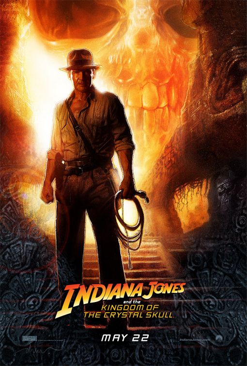
other sizes: 800x1185 Poster design by BLT Communications, LLCPoster illustration by Drew Struzan
Additional designs: (view gallery)
Want to buy the poster? Try these links: