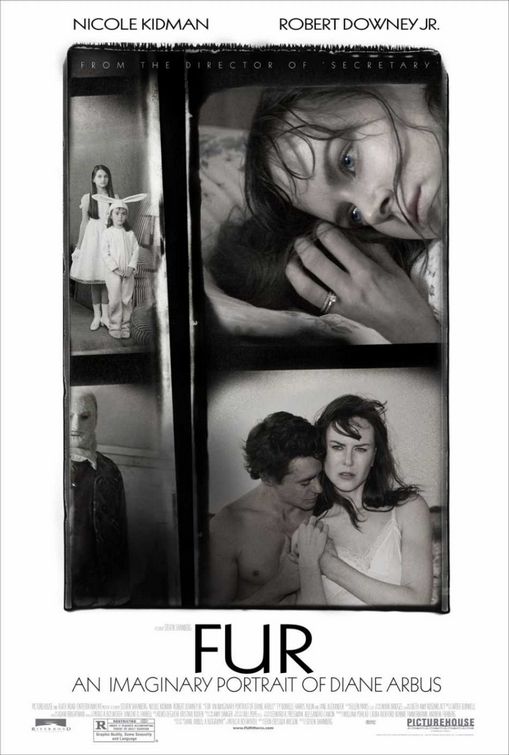
| Matt | 09-12-2006 17:39 [E,W] | | I feel the contrast is too low. The all caps is very hard to read, and the tracking makes it even harder to read. The art varies from what was orginally presented on the website... from the picture house website, not the furmovie.com website. I was looking forward to displaying this poster, but I'm only left disappointed and will probably display this poster in the backhallway of my theater. I hope to see future versions. | | Matt | 09-12-2006 17:59 [E,W] | Sidenote: The kerning in the title between the F and the U; and the U and the R, is horrible. And it took me 10 minutes to find the tagline, 'From the director of Secretary'.
If I were picturehouse, I would be upset. | | James | 09-13-2006 02:14 [E,W] | | LOVE IT! | | Sebastian B | 09-13-2006 11:51 [E,W] | | Gorgeous Poster!....Nicole looks really like Arbus...a very photogenic poster! | | kev | 09-14-2006 22:14 [E,W] | | amazing. one of the best i've seen this year. | | JadeJi | 01-13-2007 04:53 [E,W] | | i don't know, but i much more prefer this poster than the other one which has got added some more colors. cuz when you add some more colors, it could just make the visual impact of the images become less... |
|