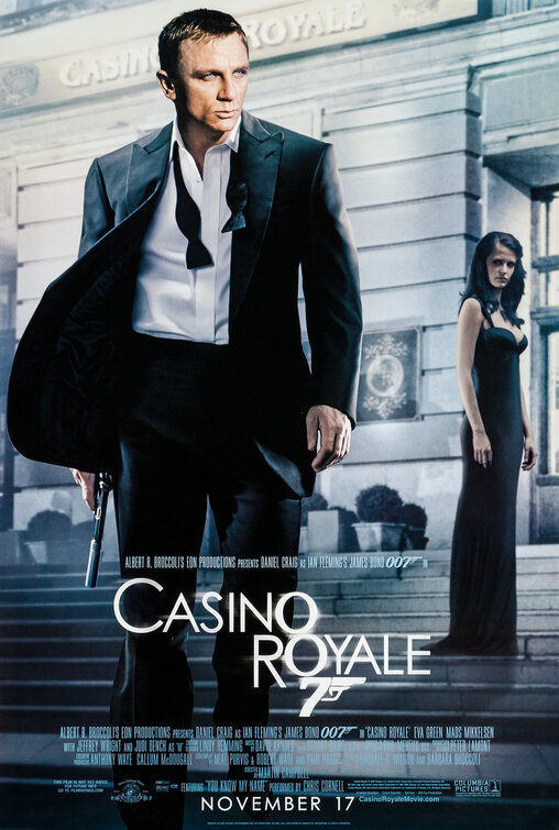
Obviously a head strip. Light sources and shadows do not quite fit properly. Image of head from a daytime shot doesn't blend well with this night time scene. Girl in background not necessary (client probably wanted her in the picture somehow). Nice new take on the 007 logo.
Man, this poster is such an obvious Photoshop job. Just cut n' pasted Craig's face into the image. The first poster was much better. Still, none of them really make Daniel Craig look more James Bond-like.
Is it me or does his face look evil. He looks old and tired and grey.
brian
09-15-2006 04:59 [E,W]
terrible poster. completely dull, and the photoshop work is abysmal. it seems to be pretty popular these days to badly paste heads on bodies. i hope this isnt the final.
Alex
09-15-2006 10:15 [E,W]
I think the poster would actually be better if Craig's head did not look so photoshopped. So far the teaser poster is definitely the best.
strannix
09-15-2006 12:10 [E,W]
This might be the worst poster in the history of the Bond franchise. It just looks awful.
007
09-15-2006 19:44 [E,W]
mmmmm...
head strippy,
tasty
indabiz
11-13-2006 00:16 [E,W]
Unimaginative concept. Less than desirable headstrip
private_meta
11-04-2006 06:55 [E,W]
wow... this poster really looks artificial... they could've done it a whole lot better...
Ratticus
10-05-2006 19:35 [E,W]
Awful. This poster is insulting to our intelligence. Lifeless and staged. Doesn't improve nor compliment the brand.