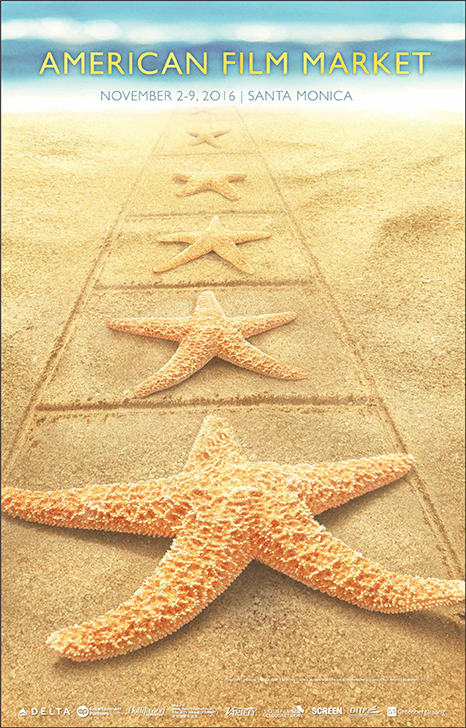
In the age of digital filmmaking, how do you sell a “film” festival or market without using the
internationally recognized filmstrip? This was part of the conversation for the American Film
Market’s 2016 official poster, which led to the “Starfish Walk of Fame” metaphor. In the beginning
of November, while much of the world is raking leaves and preparing to shovel snow,
the Los Angeles beaches are an inviting location to buy and sell product. Cannes has its glamour,
Sundance has its indie spirit and AFM has deals made in the warm California sun.
The locale was part of the story the design team chose to sell.
Q&A with Jonathan Wolf, Managing Director at American Film Market
As AFM’s managing director for 18 years, you’ve approved many posters. Which elements and tone do you feel are typically the most appropriate for the official AFM poster?
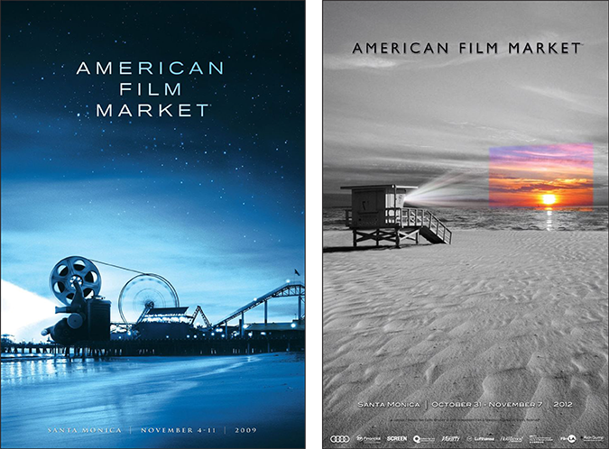
Since the AFM poster isn’t used for marketing – it’s revealed about a week before the show – we seek art that Industry professionals around
the world would want to hang in their offices. We look for fun or surreal images that convey film or destination, or ideally both.
Are filmstrips in poster art an outdated reference – or do they still have a place to help tell a story?
Film sprockets and reels can still work if the art has a retro feel. Otherwise it’s time to move on.
Film festivals, like film distributors often create art by committee. Is that a difficult process to have so much input, or is it more effective when sharing ideas?
Our approach is likely similar to the process of developing a film poster. Artists create many comps; a small group selects four or five
favorites and provide comments; the artists make changes to the favorites based on the comments; the small group selects its one favorite;
the artist makes final tweaks. Our poster isn’t used to promote the AFM so there’s less pressure to “get it right” and more willingness to
defer to the artist. We don’t create the art; we react to the work of artists.
But it’s not always the location that inspires a unique graphic, as Tomasz Opasinski,
Creative Lead at Netflix and contributor to over 500 television and film campaigns collectively –
explains his inspiration for his recent iconic award-winning festival poster.
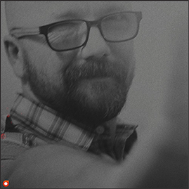
Q&A with Tomasz Opasinski, Creative Lead at Netflix
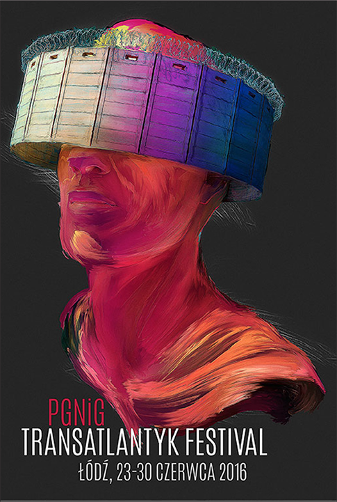
Congratulations on your recent Clio Key Art win for the Transatlantyk Festival poster. Tell us about the creative direction you were given for your poster graphic, and the inspiration you found to create it.
Thank you so much. I sincerely appreciate it. I have a long history with the Festival and Festival’s Director – Jan A. P. Kaczmarek. This years
Festival had a theme: Migration of People. Migration ranging from geopolitical, religious to economic reasons – and with this poster we were
trying to convey global reaction to what is happening around the world. It was a tough assignment to find one image to illustrate all this. It
worked out nicely in the end.
What makes for a good film festival poster? Is it the environment it takes place in or is it something intangible connected to the world of cinema?
It’s the metaphor that illustrates the story we’d like to convey to people looking at the poster. In a nutshell, we’re looking for intrigue, story
and impact. It has to read quickly because you’re only seeing it for a second or two. We want you to walk away thinking about it and wanting
to see more.
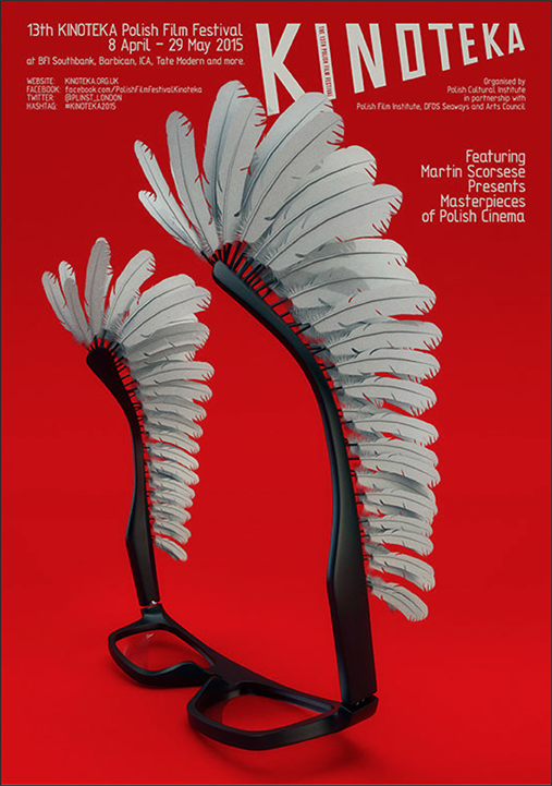
The Kinoteka poster nicely reflects the “intrigue” and “impact” you mention. What was
the inspiration
for this piece?
Two things inspired the Kinoteka poster: Martin Scorsese’s iconic glasses (the festival featured “Martin Scorsese Presents Masterpieces
of Polish Cinema”) and bravery, represented by historical wings used by Polish Hussars: www.badassoftheweek.com/hussars.html
Do you approach your day job at Netflix differently than your designs for film festivals?
Oh, yes. These are two different mediums. To start, one is meant to be viewed on a small screen, while the second is meant to be printed
large! This alone creates a whole set of styles, rules and challenges.
Your style reminds me of the celebrated Polish artist Andrzej Pagowski. Which artists influence
your creative process, and why?
To be perfectly honest, I don’t really have any influencers’ because I have to produce such a wide range of styles for many genres. I simply
can’t lock-in on a certain style inasmuch that it narrows my already niche market. I’ve created my own style over the years for which I find
inspiration: colors, shapes, situations, words, etc. Posters are a pretty specific medium. Commercial posters are even harder to create because
of a wider audience.
Your work has a painterly quality to it. Is your preference to create in the digital realm, or do you like to get your hands dirty with paint, pastels and charcoal pencils?
I used to paint a lot when I was younger, but over the years it all transferred to the digital realm. I do sketch sometimes, but it requires a
certain project for this to happen.
You seem very interested in teaching the next generation of poster designers (i.e.: the recent presentation “How to design a movie poster” at this month’s Adobe Max). What’s the most important bit of advice you share with your students?
Yes. I do have Master classes on occasion, and most of the time my main advice is – experiment. Why? Because each poster that you create
will be different: each actor will be different, and each environment will be different. Most likely, you won’t be able to make two posters that
look exactly the same. For this you have to experiment with different techniques, compositions, color treatments and typography.
. . .
About the author: Tami Shelly is an award-winning creative director at Greenlight Creative – a Los Angeles design agency
specializing in entertainment advertising. Some clients include:
Amazon, Lionsgate, Music Box Films, Revolution Studios,
MGM, NBCUniversal & Sony. Greenlight Creative designed the key art for the official AFM 2016 poster. GreenlightCreative.net
Special thanks to Tomasz Opasinski and Jonathan Wolf
