 For over 30 years First Run Features has fostered the release of daring, and often controversial films, such as the Academy Award nominated The Most Dangerous Man in America: Daniel Ellsberg and the Pentagon Papers, The Trials of Henry Kissinger and For The Bible Tells Me So. Today, the company remains an active player in the independent scene, releasing about 15 films theatrically and nearly 40 titles on DVD and Video-On-Demand annually.
I sat down with First Run Features VP Marc Mauceri to discuss his approach to key art and entertainment marketing. A former NYU film-school undergrad, Marc is a true lover of cinema and appears comfortably ensconced in New York with his wife and two children.
 Darryl - First Run Features has an extensive history of releasing documentaries. In terms of artwork, do you approach a documentary
theatrical release differently than a fictional film?
Darryl - First Run Features has an extensive history of releasing documentaries. In terms of artwork, do you approach a documentary
theatrical release differently than a fictional film?
Marc - Yes. Fictional films can have more leeway in terms of text needs, style and feel, whereas docs usually have to convey the concepts of "important" and "authoritative". There is also a greater need in doc key art to represent the essence of what the film is about.
D - When you release a documentary are you competing with all of the film studios or strictly a niche of art house folks who cater to independent film? Simply put, whom are you creating the poster for?
M - Successful key art will follow the film through all platforms - theatrical, DVD, VOD, Internet, etc. It gives a visual identity to the film. In all those platforms we are competing against everything else, and in many cases the key art is first and primary weapon in the arsenal. It’s not only important for consumers but also all the decision-makers everywhere we are trying to sell the film to.
D - When you acquire a film, do you go on a gut instinct or is there a criteria of elements required to manage the risk, such as: cast, genre, and director?
 M - Purely whether we like the film. Even if we're not sure we can sell it, being a private company, we have the luxury of being able to acquire films simply because we love them, believe in them, and/or support their message or theme. Of course we like it when our films are successful, and gauging the possibilities of their success plays into our acquisition decisions.
D - Have Michael Moore's mainstream awareness, or the popularity of An Inconvenient Truth and Super Size Me made marketing documentaries easier, or, conversely, set unrealistic expectations?
M - Generally I think its made for a landscape where more people are open to seeing docs.
D - Do you think that a younger demographic has embraced documentaries due to Reality TV?
M - Good question. I don't know. But, I hate most reality TV, and I suspect that there is little correlation between reality tv and the kinds of films we distribute.
D - Let’s get to the key art or poster art. When you come up with the creative brief, which is the directive for your design agency to follow – do you tend to give specific concepts or is it more of an overview of which elements to highlight?
M - It depends on the film and the agency. For you guys (Greenlight Creative), I will always want to give as little direction as possible, I just want you to see the film and trailer to understand the general themes we're going after, then let you do the conceptualization.
D - Having done a few campaigns for you, I recall you mentioning on one project that the core marketing was to occur in the digital realm. Does that minimize your emphasis on generating a terrific poster?
M - No, because we always release our theatrical films on DVD, as well. This makes it even more imperative that our key art translate to small and very small sizes, though.
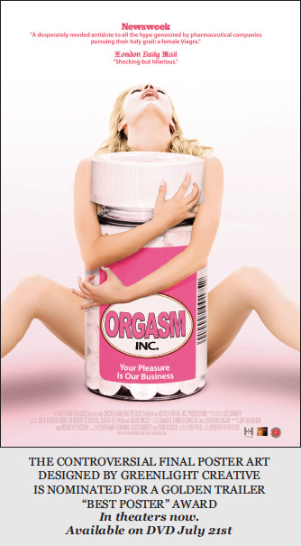
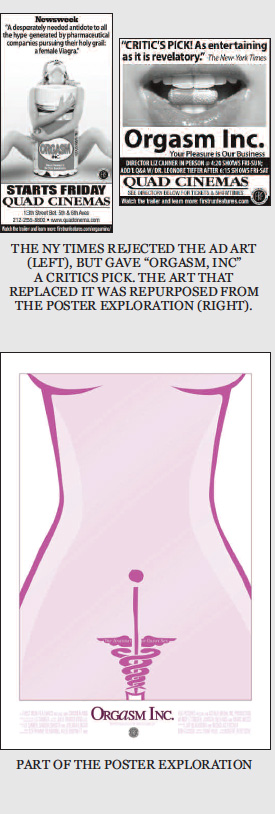
D - Yet, you also supplement your digital campaign with newspaper ads. Do the ads generally reflect the poster art or do you sometimes mix it up (as in Orgasm, Inc)?
 M - The ads should reflect the campaign, but that doesn't always work for every film, so sometimes you have to wing it. A design that is highly dependent of colors, for instance, sometimes suffers in B/W ads. For Orgasm, we had numerous places turn down the theatrical key art for being too risqué, so we had to use a backup key art.
D - Do you see theatrical campaigns eventually going all-digital?
M - No.
D - How much time do you give the design team to turn in their first round of explorations? And do you find that more time equates to better presentations?
M - I don't have a timer going, but I would expect that in working with you guys that the more time I give, the more options you'll have. But sometimes I may have a definite needs-by date which I'll tell you about.
D - Has it been your experience that you choose one concept from the initial presentation and finesse it – or do you like to play around with a few ideas to see where they go?
M - Our decision-making is very collaborative, with myself and company president Seymour Wishman leading the charge. First we agree on a favored concept, and then finesse it before showing it to the filmmakers for their input. But there are exceptions.
D - Sometimes there are instances where hundreds of poster variations are created and the client inevitably selects the very first comp they liked. Do you find that you also eventually return to your initial gut reaction?
M - Certainly this is true of our company president. But, I personally like to sit with a few favored concepts, try them out on certain employees and friends, and give them some time to sink in. Then having the filmmakers opinion is
crucial as well.
 D - Who has the final say?
M - Final say: Seymour.
D - You typically juggle many projects at the same time and I imagine that it can be difficult to see every marketing angle. Therefore, is it important for a creative agency to present ideas you haven’t thought of – or do you prefer them to maintain a strict adherence to your creative brief?
 M - We love to see lots of ideas! No strictness whatsoever. However we may have the occasional title that we really want a certain image or look.
D - Lately, I’ve noticed a lot of deeply saturated colors making it into final artwork. How important is color in artwork?
M - I personally think its highly important, but I'm sometimes alone in this.
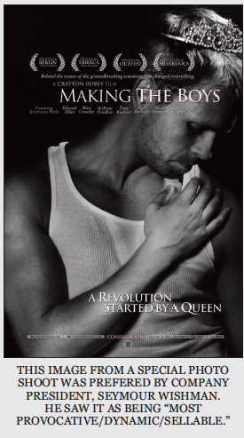
D - I understand that Making The Boys did very well in its New York opening. There were many explorations that hit a variety of directions. What about the artwork resonated with both you and company president, Seymour Wishman?
M - Actually the art we chose was not favored by Seymour, rather the filmmakers were extremely enthusiastic for it, and it was my favorite as well.
D - Do you recall Seymour’s preference? Why did the final win out over his preference?
M - He liked the queen shot. He thought it was most provocative, dynamic and sellable. I agreed to a certain degree, but didn't think it represented the film, and the filmmakers also felt the same.
D - What were the challenges in marketing Making The Boys?
M - Getting people to go see any doc is a challenge. Docs need huge critical acclaim. Probably for this film, the biggest challenge was getting it into the best theaters.
D - The final poster suggests that you’re going after a particular niche. Was this a case of preaching to the choir or do you feel that the artwork reached to a wider audience?
M - It’s a little early to know for sure, since its only been in theatrical release (DVD/VOD is Sept 20). But I gather its mostly about preaching to the choir - which is not so bad.
D - Not so “bad” for this demographic, or in general?
M - Meaning we've done well for films that mostly appeal to a gay and/or lesbian audience.
D - Which delivers the box office dollar - the people who are passionate about the subject, or a broader audience?
M - For our films, the broadest possible passionate audience.
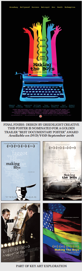
D - As noted in the final artwork, many of the explorations for Making The Boys were conceptual in nature due to a lack of photography. Are most documentary projects sorely lacking in photographic assets?
M - Some are. In my experience, I'd say about half the time we have good images, the other half we don’t.
D - Do you personally prefer artwork that is conceptual, or literal? Do you always look at how the key art will translate to dvd – is that a deciding factor in your poster decision? Or might you just plan on creating new dvd artwork?
M - Personally I would lean more towards conceptual but it really depends on the specific film and design. And yes it is a requirement that our theatrical key art be useable for DVD exploitation, which also means Amazon/Netflix-sized useage - so we always consider that, and how it will translate at smaller sizes.
D - Greenlight did a special photo shoot for Making The Boys, and a couple pieces of artwork are particularly interesting to me. One showed a male adult wearing a tiara, while another presented a series of words incorporating intolerance and the social mores of a bygone era. Did they push the envelope too far? Would the MPAA have rejected them?
M - No, not at all, especially since we don't rate most of our films! The tiara was Seymour's favorite but the filmmakers were resolute in rejecting it. The words didn't work at all - we needed a strong visual.
D - If you don’t rate the film, do MPAA regulations not apply?
M - More or less. There may be some situations where you need MPAA approval, but for the most part not having MPAA doesn't affect our releases.
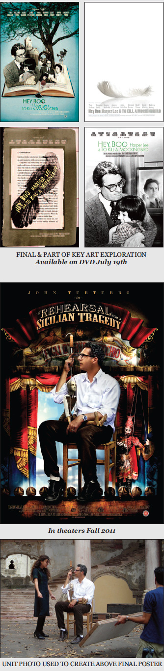
D - You had Hey Boo: Harper Lee and To Kill A Mockingbird open in May. What can you tell us about this film and its marketing challenges?
M - We needed to tie our key art to both the legendary book by Harper Lee and the Hollywood film, two beloved American classics.You guys did a spectacular job. The challenge was really having the filmmaker and us agree on the concept.
D - Some believe that fiction films are personality driven while documentaries are subject driven. Your documentary title, Rehearsal for a Sicilian Tragedy, scheduled for a fall
release, appears to sell the subject matter along with the actor John Turturro associated with it. Is that the best of both worlds when selling a documentary?
M - I don't necessarily agree with the first statement. Every film has its strongest selling point or points, whether it’s subject matter, personalities on screen, authorship or something else. You just need to know what that point, or points are and capture it with your key art.
D - Finally, what’s the value of key art? Is it creating awareness, associating a positive emotion with the experience. What does a perfect poster engender?
M - Besides the film itself the key art is the most important part of what gives a film its life, and sales potential. It must be striking and memorable and make people want to see it. It should also be versatile and able to work in a variety of mediums: large, small, color, b/w, online, print, ads, sell-sheets, etc. It obviously should support the concept of what you are trying to sell people on, and, hopefully, be truthful. It should withstand the test of time - will you love it as much in 5 years? 10 years?
I'm not trained in visual design or psychology so I'm not sure about the value of associating emotion with film posters. But I do know what I like when I see it, and what I don't like, and gut reaction, for the most part, is what I go on.