 The big film studios cast a long shadow. Their films come in waves with endless renditions of adrenaline-packed actioners, high-concept comedies and effects-laden hits that clean up at the box office. Yet, independent film remains the heart and soul of American Cinema. Award Season is happy-time for the Indies as gripping performances soar on the coattails of weighty themes, eclectic humor, and visceral emotional flourishes that expose the human spirit. During this time of transition when many of the studios have shuttered their niche distribution arms, Magnolia Pictures has shrewdly released an impressive array of films, forming a vital artery for the lifeblood of independent cinema.
Recently, I sat down with VP of Marketing Matt Cowal at the NY offices of Magnolia Pictures. Matt's a thoughtful sort who weighs things carefully, and it quickly became evident how deeply attached he is to the projects he works on. This personal investment is at the core of what drives the independent scene from auteur to marketeer.
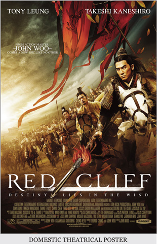 Darryl- As someone who has spent time in China, I noticed that the Red Cliff poster has this painterly quality that I've seen in temple murals and throughout China. Is that a happy accident, or something you set out to do?
Matt- There was a wide assortment of explorations we did, and it's just something that we came to, eventually. We really liked this version because it captures what the movie is, which is a painstakingly crafted epic - so we wanted to give the poster a stately look.
D- John Woo is credited in the artwork. There are really only a handful of directors mentioned in printed artwork, so obviously you felt he was a powerful draw.
M- John is a legend and people know him in the States. They remember him from Mission Impossible and Face Off, so he is a commodity. This film is really kind of his magnum opus, so it would have felt odd not to credit him on the poster.
D- The epic film quality is something you really emphasized in the artwork: the large gathering of warriors, the spears, horses, flags and whatnot.
M- It's a sweeping war movie with a cast of thousands, so we needed it to feel big.
D- In putting together your creative brief how did you decide who your demographic was and the direction that you wanted go?
M- There were two audiences we were going after. One was your action fan that's going to appreciate the John Woo, sweeping action-film, but also the art house, foreign-language crowd. We needed to straddle that, so we felt it had to look big, and that's why we went with Art Machine (the design agency) because they have a strong history of doing action films. But we also wanted it to feel like it would be at home in a Landmark Theater because that's the type of moviegoer this film could appeal to.
 D- You mention that you selected your creative agency based on their portfolio and what they tend to specialize in. Is that something you look for when you're deciding which agency to use on a particular campaign?
M- Absolutely. I feel that some agencies are strong in certain areas, so we always look at their previous work because we can get a good idea of what they can do.
D- Do you think agencies are branded? For example, one agency's great at comedies, another's specialty is action films, and so on?
M- Not really. The bigger agencies have done everything, but it's a good place to start. I check out their campaigns to see if there's anything I like, or a certain look I'm interested in.
 D- Was the domestic audience you were going after largely American, or were you hitting the Asian market in America?
M- It's tricky with Asian films. In the Asian market, Red Cliff was already widely available in DVD. You could buy it in Chinatown (NYC) before it came out as a domestic theatrical release. A lot of Asian-film fans are really on top of releases that come out of Asia. We felt that much of the Asian audience had already seen this film, and that was reflected in the theatrical performance of the film - so it's tricky. You would think that'd be logical place to go, but we had the same experience with Ong Bak, our Thai action-film. That was another one where the fans of the genre had already seen it, so we we're looking for new fans there, as well.
D- Were you influenced by the artwork from the Chinese release?
M- I liked it. It's beautiful artwork, but I felt a pressing need to make it different because, as I mentioned, if you looked in the windows at the Chinese video stores, you could see it there. There's also a certain look that comes out of China that's distinctively Asian, and we wanted it to feel more American. I think the Chinese artwork nailed the kind of the sweeping look we were going for, so we definitely started off with that.
D- I noticed that the theatrical art was basically repurposed for your domestic DVD release. Does that happen often with artwork when it switches from one platform to another?
M- Our Home Entertainment division makes those calls. I generate the theatrical art and they decide whether or not they want to keep it or do something different for the DVD.
D- At Magnolia Pictures, does the key art generally transfer to your DVDs?
M- It's often different. Sometimes it's a slightly altered version, and other times it's completely different. With DVDs you're dealing with a different set of rules. It's tricky because you have to take into account what speaks to retailers and what's been proven to move off of Walmart shelves. That's more of a specific thing than what's going to look appealing in a theater lobby.
D- I know that when we do work for Sony Home Entertainment, they make certain the title is positioned at the top of the artwork so when people are flipping through DVD racks they recognize the title instantly.
M- Exactly. They know what it's called, there are big quotes from the critics, and your stars are big and up front so they know who's in the film. It's a different strategy.
D- The photography for Red Cliff, was that unit photography or from a special shoot?
M- There was a tremendous amount of unit photography on this film. There was a huge disk with hundreds and hundreds of shots, which is a real luxury, and Art Machine really took advantage of it.
D- How many explorations were created?
M- I think we started out with 25 or 30, and then narrowed down to this one pretty quickly. There were probably eight revisions to the final poster after that.
D- There are cast names placed at the top of the artwork that are not widely known in the domestic market. Was that a contractual obligation?
M- Yes. Tony Leung and Takeshi Kaneshiro were contractually obligated to be on there. And with Chen Chang, his managers are the same people who manage Tony, and they requested Chen's likeness (photo) be in there in order to approve Tony's likeness, so we felt inclined to include him - though we did have to swap out a different head for the poster. But, I think for the art house crowd, Takeshi Kaneshiro means something. He's been in Crouching Tiger, House of Flying Daggers -
D- So there was a crowd he appealed to?
M- Absolutely. We weren't upset that we had to put those names up there. If we weren't obligated and we were going for something more mainstream, then maybe we'd reconsider. But to answer your question: yes. The size and order of their names - all that was dictated by the contracts.
D- Something I really liked was how the Art Director skewed the position of the characters at an angle, which immediately gives the artwork a unique dynamic because it's different than how we perceive things in life - which is primarily vertical and horizontal angles. So I thought that was a nice touch. And as a classical art composition goes, the manner in which the red flag directs your eye toward the characters, which then sweeps your eye down to the title treatment - your eye really knows where to go, which makes for a strong impression upon the viewer.
M- There's a lot of movement in the image, and the reds do pull you into the right places. They did a smart job with it.
D- (holds up a different poster) I believe this is the international DVD artwork we're looking at with the big heads in the sky. This comes across more as a thoughtful piece, more cultural, and it doesn't really play up the action.
M- It's a much different sell in Asia because the movie's based on one of the most famous stories of all time in China. Everyone knows who these characters are, whereas no one in the west does. So I think that they were going after something different. And this was one of the biggest films of all time in Asia – until Avatar came along - but it broke records so it was a big deal there. We didn't really have that luxury here because western audiences don't know the story.
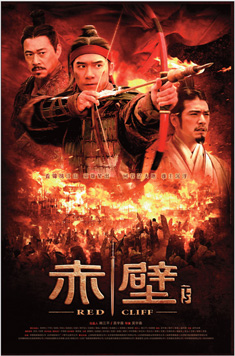
D- (holds up another poster) I'm not really sure what this artwork is. It may be the theatrical artwork for the Chinese release.
M- Yeah, I'm not sure which country that is.
D- It's an interesting piece of artwork, which employs similar colors to the domestic artwork. What I like about the domestic key art are these stormy clouds. It's a small touch that suggests an impending storm.
M- That was a big detail we carried over to the trailer. It was a storm that changed the tide of the battle and the course of history - which is the theme of the film.
D- This was an R rated film, correct?
M- Yes.
D- You've included in your artwork all the elements of an action film without resorting to a guy plunging a spear into another human being. How far can an R rated film go in terms of depicting gore and violence?
M- There is some violent moments, but you're right it's handled more artfully. Sometimes it depends on the era that's being depicted. It kind of changes. I think right now there's a lot of tolerance for violence and there's much you can get away with. Sometimes you can get away with more violence than sex. The MPAA (Motion Picture Association of America) hasn't had any problems with the content of our films – with our materials, yes. We've had to change things.
D- It seems the MPAA guidelines are all over the place in terms of what you can and cannot do. The disparity really leaves me scratching my head sometimes.
M- It's a very subjective science and can be frustrating sometimes. As a smaller company, I feel that sometimes bigger companies are given a little more leeway, but that said, there's been many times where the MPAA has rejected something and I've given a little bit more context about the release; that it's an art house film and its not going to be playing at AMC where kids are going to see it - and they've actually been good about listening to reason. So I think it's a matter of who the audience is. Their concern is; will small children see this? Most of our theatrical releases are geared towards adults and play in theaters where the bulk of what's showing isn't meant for kids. So there's not that same risk.
D- Sometimes I feel like the MPAA treats American adults as adolescents who don't know any better – and if you look at the world sometimes, maybe they're on to something. But if I'm going to see a Mel Gibson action flick, I know I'm going to see some violence – it's probably why I'm going in the first place. Doesn't make me a bad person. In my head I know it's all pretend. And sure, they have to draw a line somewhere, but these restrictions are based on values that are perhaps not shared by many. Yet, many cultures find what we're already doing quite appalling.
M- I guess their whole theory is if it's out there, children will see it. So certain disturbing images; which is any instances of blood, are rejected. I think kids already see really violent stuff on TV, but that said; the decisions the MPAA makes are generally ones that we're able to work around. Even for darker horror and action films you don't need to conjure the most grisly thing possible to reach the audience you seek.
 D- Lionsgate gets away with stuff that sometimes turns me off. But I dig their creative. They're very clever about finding fresh concepts.
M- I don't know how they do it. It's pretty impressive. I wish I had the ability to test those boundaries now and then.
D- Let's talk about I Am Love. With an action film it's fairly simple - you're selling the action, the star of the film, a sense of movement and all the thrills that go with that. Whereas, with I Am Love, and actually the bulk of the films Magnolia Picture does, there's a lot of nuance in play that makes your job as a marketer more difficult because you have all these subtleties to contend with. Dramas are oftentimes absent of that bold stroke and require a masterful touch to get the message across. Sometimes dramas come into our agency and were thinking; Wow there's so many terrific things going on, but no real "hook" or bold stroke to hang them on. So tell me a little bit about what you're your thoughts were when this film came in.
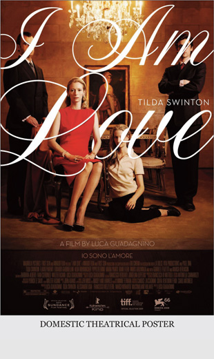
M- I Am Love is a luscious, rich, amazing film, from a very talented director named Luca Guadagnino who's got a bold future. There's so many great art house sells here—the exoticism of Italy, which is beautifully shot in this movie. There's food, fashion - Silvia Fendi (of the Fendi fashion empire) is one of the producers, and the costume design was by Jil Sander, so everybody's just dressed amazingly. And then you have Tilda Swinton, who's beautiful and a fashion icon. We were trying to give our materials a rarified feel—modern, but at the same time classical. A lot of people are calling it reminiscent of Visconti. So it has a foot in both worlds, and that's what we wanted to convey.
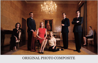 We think all these elements are really appealing to audiences, and in
our trailer we showcased all that. I think we were blessed with amazing artwork for the poster. (Points to foreign poster.) This is the shot they've been using in Italy. Pier Paolo Ferrari did the photo shoot. He took
individual shots of every cast member, so this photo is actually a
composite. We tried a bunch of different things, but kept coming back to this because it was such a striking, beautiful image.
We think all these elements are really appealing to audiences, and in
our trailer we showcased all that. I think we were blessed with amazing artwork for the poster. (Points to foreign poster.) This is the shot they've been using in Italy. Pier Paolo Ferrari did the photo shoot. He took
individual shots of every cast member, so this photo is actually a
composite. We tried a bunch of different things, but kept coming back to this because it was such a striking, beautiful image.
D- Sometimes, when you shoot the whole cast together, if someone in the photo blinks or doesn't like the way they look, they can reject the use of the photo. One option is to replace a different head on their body, but shooting them individually provides more options in composing the artwork.
What I found interesting about the I Am Love photo is that it seems like a portrait of royalty. She's wearing red, a color generally associated with royalty. There's a Renaissance painting on the wall behind them and a crystal chandelier above them. It's rather unique that everyone's face is covered up by the title, except Tilda's. In effect, this drives you straight to her face and she draws you in by looking directly at camera.
M- We wanted something that differed from the Italian poster, which is a photo of the entire family. The Italian poster is gorgeous but very much an ensemble sell, and for US audiences it was more important to highlight Tilda Swinton. Obviously, there's a lot more to this film, but we felt that she was the main attraction and we wanted her to be front and center. So this comp was just one of the ideas created by The Refinery (creative agency), and we took to it immediately. I think they did a fantastic job - it pops right out and feels very modern with this big florid title covering people's faces, but at the same time has a classical feel with this austere looking family.
D- Just the fact that you're covering up the actors' faces. That's just not done.
M- You're right. If you were dealing with Hollywood stars, for example, you wouldn't be allowed to do that. So we were able to take some liberties because we didn't have any contractual obligations. While these are amazing actors, they're not well known in the United States, so we were able to play around with that.
D- And if you think about it, it not only plays up the fact that Tilda's the star, it also tells us it's her story; its all about her. Perhaps that's self-evident, but it's good marketing to hit that information home.
M- Well, she's the heart of this family - the matriarch, and it's about her awakening and breaking away from family. So that's why it was important to make her the essential focus, in addition to her being the natural star for our audience.
D- For those who aren't familiar with contractuals – in terms of size, typically an actors name is about 35 percent of the title. And in the artwork, Tilda's name is very small in comparison to the title.
M- Also the billing block is supposed to be in proportion to the title, which is why we put the title on the artwork a second time, just above the billing block (credit block). We did it in Italian to kind of satisfy the title requirement for the MPAA.
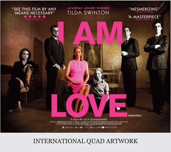 D- Another little detail is the order of the credit block. In this billing block, the screenwriters' are placed right after the cast. Usually, they're on the bottom line or near the producers.
M- That's what the production company wanted, so that's how the billing block was delivered to us.
D- I guess they have different guidlines than we do in America. For example, here is artwork that I presume was used in the international territories. It's more horizontal in form than American posters.
M- That's the Italian poster. In the UK they're called Quads. It's just the size they have in the theatres. I was talking to a guy that does design for the UK. I told him I was kind of jealous of the quad looks and wished I could do something new, and yet he was hungering to do the vertical. I guess the grass is always greener.
D- What I'm hearing from many people in positions such as yours is that they're a little concerned about the print world. They're afraid that maybe it's going away, that print has become a dinosaur. We're seeing these living one-sheets in the malls that have motion graphics added. We're seeing Internet banners and Video-on-demand quite possibly making print materials for home entertainment unnecessary. Do you have a sense that print is in decline?
M- To a certain extent. But we'll always need these images. They're a starting point for a campaign - even the motion posters come from this, and then it may evolve into something else. It's a little different in the studio world when you have a high-budget movie and a lot at stake because there are genres that have a certain poster-like language - especially with comedies and thrillers. People feel compelled to repeat the same things. Which is hard to fault because it's been working great for them. You know what I'm talking about: big floating heads, or comedies with red titles on a white background. Look at Date Night; two big words, two well-known actors—straight and to the point. Very much in the marketing language of the modern comedy, and it maybe doesn't make sense to take a big risk there since it's been shown to work.
But, yeah, I know there are people who pine for the golden days when every poster was hand painted and super stylized. And that to some extent is on the decline. Ultimately, a poster is an ad. (Darryl gasps). Fortunately with Magnet and Magnolia, we're often in a position where we can be creative on how we position our posters.
D- Do you have a particular philosophy about what posters should do? Some people feel that it's about the emotion. Someone's driving past a bus shelter and you have two seconds to hit them. Or is it more about the information that's on the artwork? Is advertising an intellectual exercise?
M- It depends on the project, I always start off with the information. What are the best assets this film has? How do we get that out there immediately? How do we do it in a way that reaches our audience? We work for niche audiences. That's where our company lives. We are not trying to get everyone in the country to see our movies. We are trying to find our audience and have them all see it. So it's really important to have something that appeals to that audience, whether it's art house, action, or Thai martial-arts. We know we want to reach the people who will like this type of movie and want to see it, so a lot of the information aspect goes into the design. But you also want the artwork to be an attractive piece that you're proud to tack on your wall. Ideally, you'd like to get all those elements to work and a lot of times you can't. Sometimes it's one or the other. (Refers to Red Cliff and I Am Love) These are two examples that I really do love and are hanging in my office - and that's really satisfying.